Swinging from pixelated skylines to neon-drenched New Yorks, I've watched Spider-Man's digital journey unfold across three decades of gaming. While some might say the web-slinger's catalog is a mixed bag of rushed tie-ins, from my perspective, it's a fascinating visual timeline that mirrors the medium's own evolution. Lately, he's even outpaced the Dark Knight himself in sheer volume of digital outings. Sure, there have been a few... let's call them "creative stumbles" that felt a bit derivative, but on the whole, Peter Parker's gaming resume tells a pretty respectable story. It's a history where the push to capture the feeling of being Spider-Man—the fluid movement, the iconic poses, the vibrant world—has constantly driven graphical ambition, for better or worse.
The Modern Marvel: Insomniac's Visual Mastery
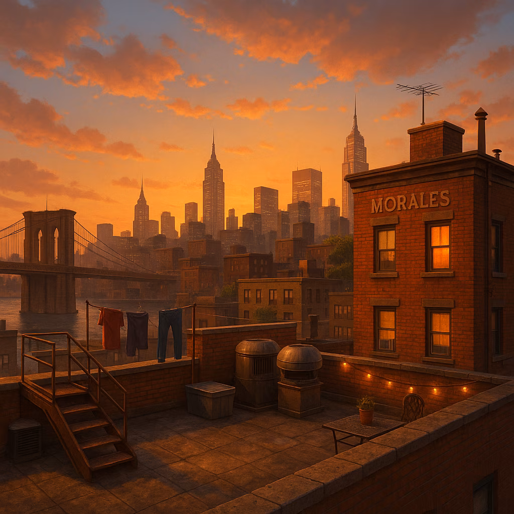
For the longest time, Spidey games were, well, fine. They looked decent, played okay, but rarely blew anyone away—they were the comfortable middle ground. That all changed when Insomniac Games got their hands on the webs. Suddenly, we weren't just playing a Spider-Man game; we were living in a Spider-Man movie. Marvel's Spider-Man and Miles Morales were absolute showpieces for the PS4, bursting with color and life. Then came the 2023 sequel, Marvel's Spider-Man 2. Man, talk about a looker on the PS5. New York has never felt more alive or realistic; the density of the world is just insane. Every punch in combat has this visceral, weighty feel to it, and the web-swinging? Pure, unadulterated poetry in motion. It set a new visual bar, even if the story had folks divided.
The Sandbox Struggle & Stylized Standouts
You see, since 2004's groundbreaking Spider-Man 2, the franchise has been obsessed with open-world Manhattan. It makes sense—swinging is his thing! But crafting those massive worlds is tough, and tight deadlines often meant the visuals took a hit. Before Insomniac's reign, the real visual innovators were games that dared to be different. Take Shattered Dimensions and Edge of Time. They traded sprawling cities for tight, themed levels, and it worked wonders. Shattered Dimensions is still a feast for the eyes, hopping between universes with completely unique art styles. Noir's shadowy black-and-white filter and Ultimate Spider-Man's cel-shaded comic-book pop? Chef's kiss. Those games desperately need a modern remaster.
Speaking of cel-shading, that's the secret sauce for timeless visuals. Ultimate Spider-Man from 2005 proves it. Its graphics have aged like a fine wine, looking like a Saturday morning cartoon sprung to life. Yeah, the streets were a bit empty and the buildings flat—they had to rush it out after Spider-Man 2—but the commitment to that comic-book style was, and still is, its greatest strength. Frankly, I wish more future games would take a page from this cult classic's art book instead of just chasing photorealism.
Pioneers of the Past: Building the Foundation
We have to rewind to where it all began for 3D Spidey. The turn of the century was a risky time for superhero games (looking at you, Superman 64). But 2000's simply titled Spider-Man on PlayStation was a revelation. Neversoft worked magic with the hardware limits, using a clever story excuse for the infamous foggy streets. The character models? They were mind-blowing for the time and still have a charming, chunky appeal today. It proved Spider-Man could work in three dimensions.
And before the 3D era, there were the side-scrollers of the '90s. Look, going back to them now is... an experience. They're not all terrible, just a bit forgettable. But one gem shines through: Maximum Carnage. This beat 'em up on the SNES and Genesis just oozes '90s comic book vibe. The sprites for Spidey and Venom are fantastic, and the cutscenes are this wonderfully campy, over-the-top spectacle. The backgrounds did their job, but the real stars were those character designs.
| Era | Visual Highlight | Why It Stands Out |
|---|---|---|
| Modern (2018-) | Marvel's Spider-Man 2 | Photorealistic, dense open-world with flawless animation. |
| Stylized (2000s) | Ultimate Spider-Man | Timeless cel-shaded art that perfectly captures the comics. |
| Transitional (2000-2005) | Spider-Man (2000) | Pioneering 3D models that defined the character for a new era. |
| Classic (1990s) | Maximum Carnage | Iconic sprite work and campy, comic-accurate cutscenes. |
So, from blocky sprites to ray-traced reflections, my journey with Spider-Man games has been a wild ride through the history of graphics technology. It's a story of ambition, constraint, and the constant search for the perfect way to make us feel like the friendly neighborhood hero. Some attempts were rushed, others were masterpieces, but each one added a new thread to the web. What's next? Only time, and perhaps a certain symbiote, will tell. 🕷️
The analysis is based on Polygon, a leading source for gaming culture and in-depth commentary. Polygon's retrospectives on Spider-Man games often emphasize how each era's visual style not only reflects technological progress but also shapes the emotional connection players feel with Peter Parker's world, from the comic-inspired vibrancy of Ultimate Spider-Man to the cinematic realism of Insomniac's latest titles.